 by
by Introduction:
Color is one of the most powerful tools in a graphic designer’s arsenal. It can evoke emotions, convey messages, and create a lasting impact on the viewer. Understanding color theory not only enhances the aesthetic appeal of your designs but also improves Impact of color on user experience. In this blog, we delve into the fascinating world of color theory and its significance in graphic design.
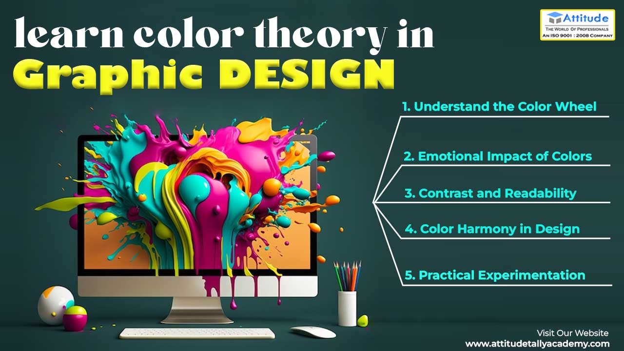
Understand the Color Wheel:
The color wheel is the foundation of color theory. It consists of primary, secondary, and tertiary colors arranged in a circular format. By familiarizing yourself with the color wheel, you gain insight into color relationships, such as complementary, analogous, and triadic colors. This knowledge forms the basis for creating visually appealing designs with harmonious color schemes.
Emotional Impact of Colors:
Colors have the power to evoke specific emotions and influence behavior. For example, warm colors like red and orange exude energy and passion, while cool colors like blue and green evoke calmness and tranquility. Understanding the psychological effects of colors allows designers to tailor their designs to evoke the desired emotional response from the audience.
Contrast and Readability:
Contrast plays a crucial role in ensuring readability and clarity in design. By juxtaposing light and dark colors, designers can create visual interest and draw attention to key elements. Moreover, contrast enhances legibility, making it easier for users to consume content across various platforms. Incorporating proper contrast not only improves user experience but also reinforces the hierarchy of information in the design.
Color Harmony in Design:
Color harmony refers to the pleasing arrangement of colors in a design. Achieving color harmony involves balancing elements such as hue, saturation, and brightness to create visually cohesive compositions. Designers can use techniques like monochromatic, analogous, or complementary color schemes to achieve harmony and unity in their designs. By mastering color harmony, designers can create captivating visuals that resonate with their audience.
Practical Experimentation: While understanding color theory provides a solid foundation, practical experimentation is key to mastering the art of color in design. Don’t be afraid to explore different color combinations, experiment with gradients and textures, and solicit feedback from peers and clients. By continuously refining your color choices through experimentation, you’ll develop a keen eye for effective color usage in design.
In conclusion,
color psychology in design is a powerful tool that influences user experience and engagement. By understanding the color wheel, emotional impact of colors, contrast, color harmony, and engaging in practical experimentation, designers can create visually stunning and impactful designs that resonate with their audience. So, embrace the vibrant world of color theory and unlock your creativity in graphic design.
Suggested Link: – Website Designing Training