 by
by Introduction
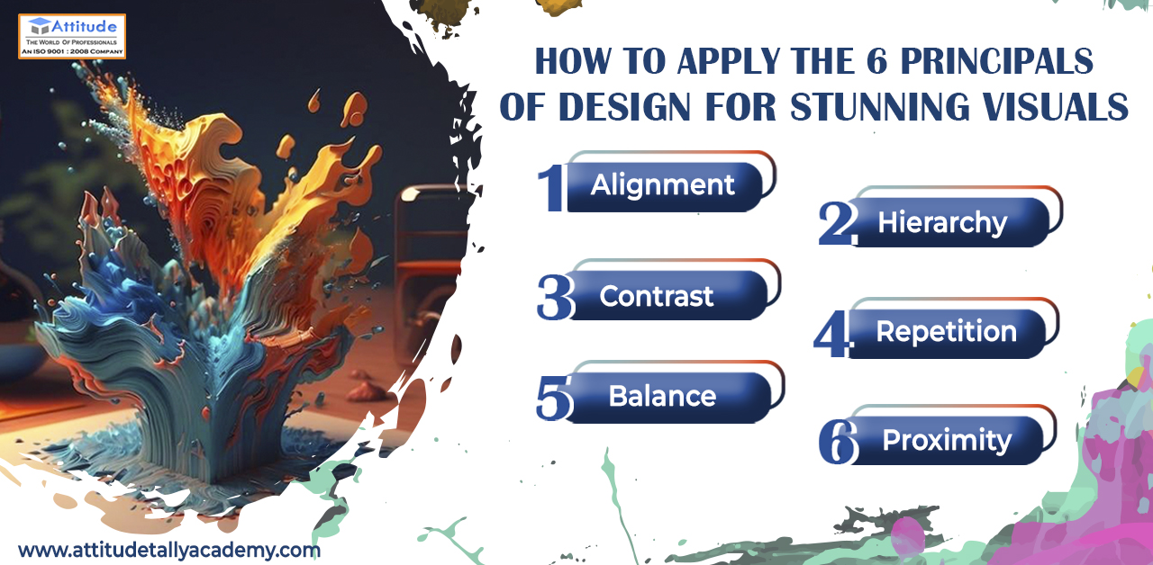
Welcome to our creative space where we explore the magic behind creating visually stunning designs! In the realm of graphic design, mastering the fundamental principles is like having a secret recipe for captivating visuals. In this blog, we’ll delve into the art of design and unveil the secrets behind six key principles: Alignment, Hierarchy, Contrast, Repetition, Balance, and Proximity. These Graphic design principles serve as the building blocks for creating designs that not only catch the eye but also convey your message effectively.
Alignment
Imagine a world without order – chaotic and confusing, right? Alignment is the invisible force that brings harmony to your designs. When elements are strategically arranged along a common axis, it creates a sense of order and coherence. Whether it’s text, images, or other elements, proper alignment guides the viewer’s eye and imparts a polished and professional look to your designs.
Hierarchy
Just as every story has a protagonist, every design should have a focal point. Hierarchy helps you establish the importance of elements within your composition. By varying size, color, and positioning, you guide your audience on a visual journey, ensuring they absorb information in a deliberate sequence. Establishing a clear hierarchy ensures that your message is not only seen but also understood.
Contrast
Contrast is the spice of design. It adds interest, grabs attention, and creates visual excitement. Whether it’s playing with colors, fonts, or shapes, purposeful contrast highlights key elements and makes your design pop. Think bold headlines against subtle backgrounds or vibrant images juxtaposed with minimalist text – the possibilities are endless!
Repetition
Consistency is key in design, and repetition is the tool that achieves it. By repeating certain elements like colors, fonts, or shapes throughout your design, you create a cohesive and unified look. Repetition establishes a visual rhythm, making your design memorable and reinforcing your brand identity.
Balance
Balance is the equilibrium that keeps your design from tipping over into chaos. There are two types of balance – symmetrical and asymmetrical. Symmetrical balance is achieved by mirroring elements on either side of a central axis, creating a sense of order. Asymmetrical balance involves distributing visual weight unequally but achieving balance through contrast. Striking the right balance ensures that no single element dominates the composition, creating a visually pleasing design.
Proximity
Proximity is all about relationships. When related elements are placed close to each other, it signifies their connection and creates a sense of unity. Conversely, elements placed farther apart imply a level of separation. Utilizing proximity effectively helps organize information and ensures that your audience interprets the relationships between different design elements as intended.
Conclusion
As you embark on your journey to create Eye-catching visuals stunning designs, remember that these six principles are your guiding lights. Alignment, Hierarchy, Contrast, Repetition, Balance, and Proximity – when applied thoughtfully, transform your designs from ordinary to extraordinary. So, embrace the magic of design and let these principles be the brushstrokes that paint your creative masterpiece! Your visuals will not only be eye-catching but also convey a message that resonates with your audience, leaving a lasting impression. Happy designing!
Suggested Link:-
Adobe After Effects VFX & 3D Animation
Adobe Premiere Pro Video Editing